Tidy Tuesday Week 29: Economic Guide to Picking a College Major
By Benjamin Ackerman
October 16, 2018
This is my first time doing 🎉Tidy Tuesday🎉 ! The data for this week came from a FiveThirtyEight blogpost, which breaks down post-college salaries by discipline. The documentation and data for this week can be found in this GitHub repo.
One thing I found really interesting in the data was the variable College_jobs, which counted the number of people per major with jobs that required a college degree. I wanted to use this information to look at each major’s median income by percent of recent grads employed in positions requiring/not requiring college degrees.
For my Tidy Tuesday submission, I will be using the following packages:
RCurl,dplyrandstatsfor data loading and manipulationggplot2andscalesfor data visualization
First, I use RCurl to download the data from GitHub:
data_url <- "https://raw.githubusercontent.com/rfordatascience/tidytuesday/master/data/2018/2018-10-16/recent-grads.csv"

data <- read.csv(text = getURL(data_url), stringsAsFactors = FALSE)
Then, I use dplyr to create a variable called pct_college, or the percent of recent grads within a major in jobs requiring college degrees.
data <- data %>%
  mutate(pct_college = College_jobs/(Non_college_jobs + College_jobs)*100) %>%
  filter(!is.na(pct_college),!Major_category == "Interdisciplinary")
For my first visualization, I wanted to look at the distribution of pct_college by field of study (indicated in the Major_category variable). Each data point is a different major. Here’s the code and the generated plot:
data %>%
  ggplot() +
  geom_boxplot(aes(x = reorder(Major_category,pct_college,FUN=median), y = pct_college, fill=reorder(Major_category,pct_college,FUN=median))) +
  coord_flip() +
  scale_fill_viridis_d()+
  guides(fill=FALSE) +
  labs(x = "Field of Study",y = "% of Major's Grads Employed in Jobs Requiring College Degree") +
  ggtitle("Percent with Jobs Requiring College Degrees by Field of Study") +
  theme_minimal()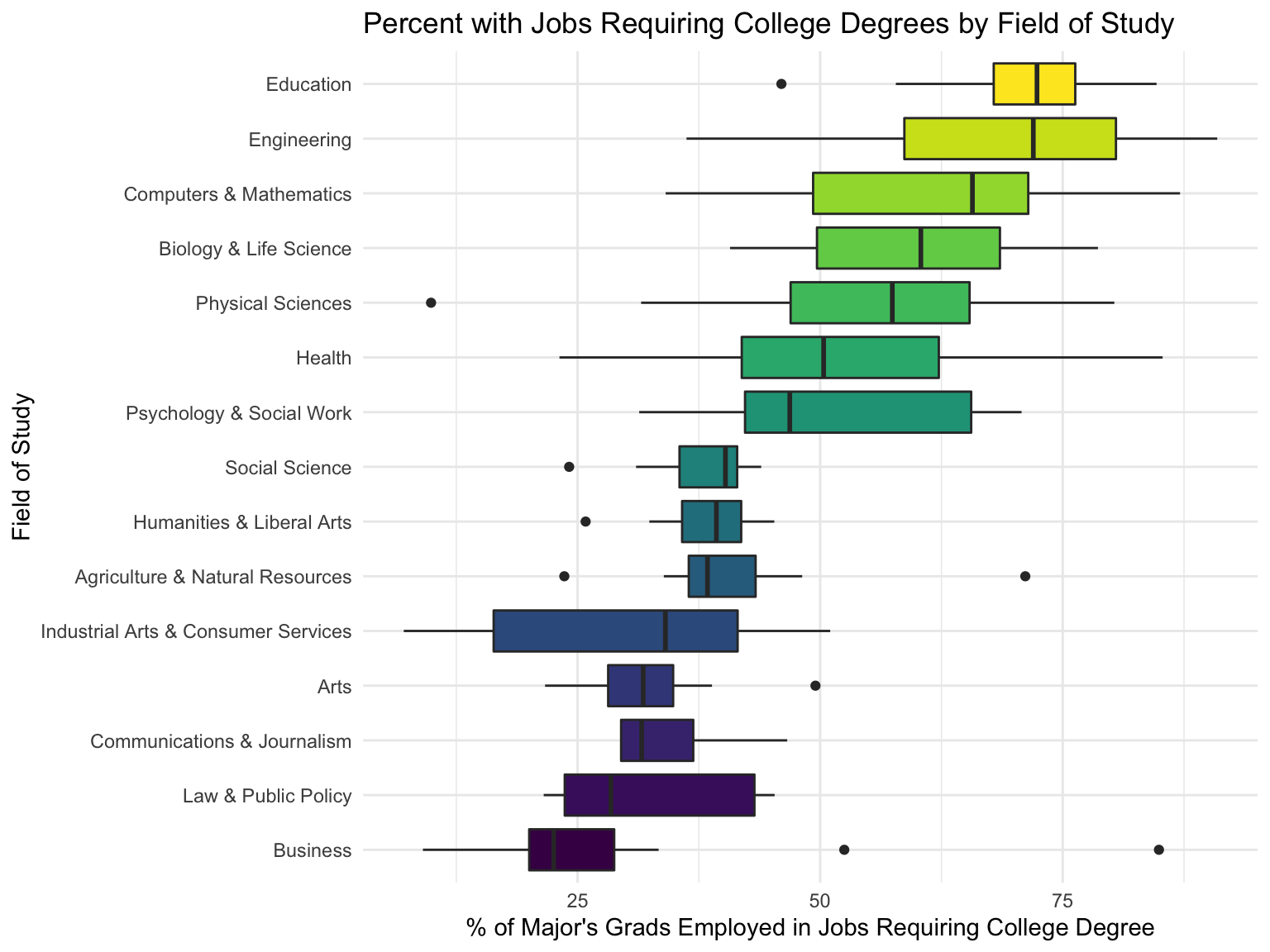
Note that the fields of study with lighter colors depict categories of majors where more students find jobs that require college degrees. Fields of study with darker colors depict the categories of majors where more college grads go on to find jobs that don’t require college degrees.
Next, I wanted to look at the relationship between median income and percent with jobs requiring college degrees for each major. I used the same colors in the plot above to group the majors by field of study:
data %>%
  ggplot(aes(x = pct_college, y = Median)) +
  geom_point(aes(color = reorder(Major_category,pct_college,FUN=median)),size = 3) +
  geom_smooth(method = 'loess', color = 'dark grey') +
  scale_x_continuous(expand = c(0,0)) +
  scale_y_continuous(labels = dollar) +
  scale_color_viridis_d()+
  guides(color = FALSE) +
  labs(x = "% of Major's Grads Employed in Jobs Requiring College Degree",y = "Median Income") +
  ggtitle("Median Income by Percent with Jobs Requiring College Degree") +
  theme_minimal()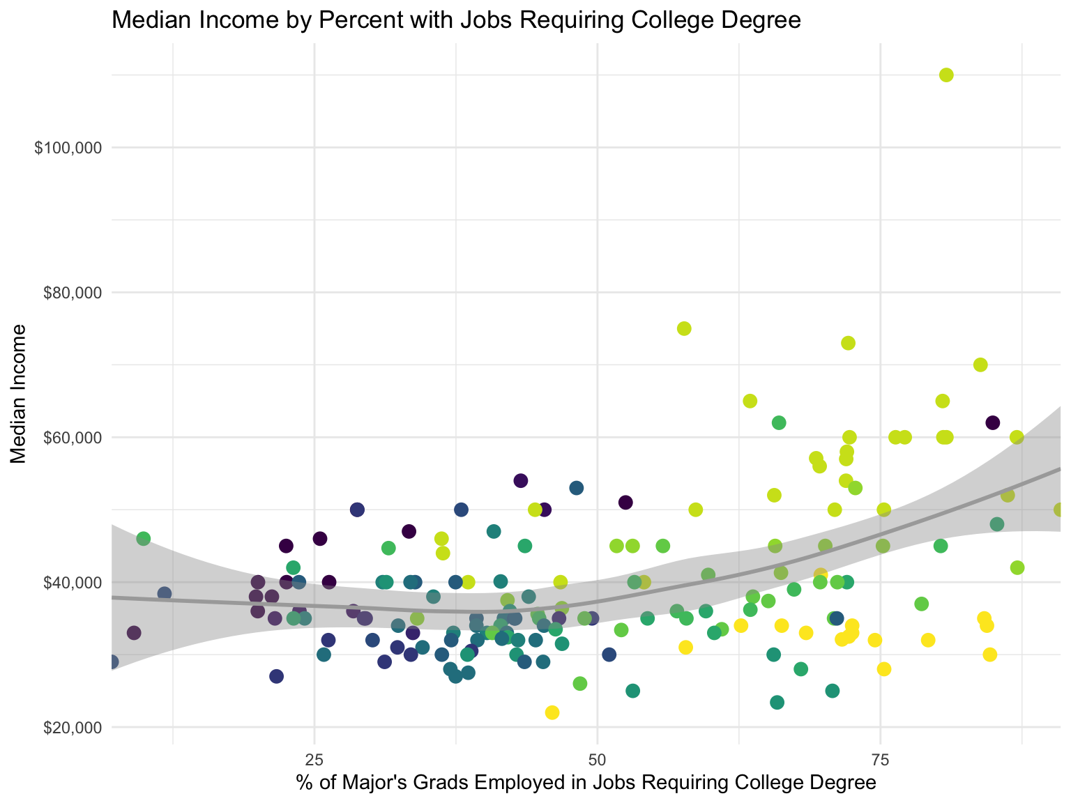
From looking at this plot, there appears to be a relationship between the two - majors with more students finding jobs requiring college degrees tended to also be the majors with the higher median incomes, whereas majors with fewer students entering jobs requiring college degrees had lower median incomes. Also, among majors with the same rate of jobs requiring college degrees, there seemed to be a nearly 20,000-30,000 dollar median income gap between the Education-related majors (in yellow) and the Engineering/STEM majors (in light green). A more rigorous analysis would be needed to assess these differences, but definitely something interesting to notice!
I hope you enjoyed my submission! Feel free to reach out with any questions/comments/suggestions. 🤗