Formatting Math Symbols and Expressions in ggplot Labels
By Benjamin Ackerman
March 8, 2019
Yesterday, I was trying to put some finishing touches on a figure I made in ggplot2 that visualizes some simulation results. The plot features several panels using facet_grid(), and uses colors to distinguish between different regression models that were fit to the simulated data. I wanted to label certain axes and panel names using the Greek letters I had used as parameter notation, and I also wanted the labels in the color legend to correspond to the different regression models I had fit.
The problem was, I had no clue how to do this! So, I consulted #rstats Twitter, got some really great tips, and figured that I’d share them all in a quick demo blogpost (mostly so that I can easily find this info the next time I need it! 😂).
First, let’s load the necessary packages:
library(dplyr); library(ggplot2); library(scales)Next, let’s generate some random data for plotting (I’m including two binary variables for grouping purposes):
data = data.frame(x = rnorm(50),
                  y = rnorm(50),
                  c = factor(rep(c("a","b"),each=25)),
d = factor(rep(0:1, length=50)))| x | y | c | d |
|---|---|---|---|
| -0.0511523 | -0.9325870 | a | 0 |
| 0.1068227 | 1.3470956 | a | 1 |
| 0.0527986 | 1.1926350 | a | 0 |
| 1.7786127 | 0.2562625 | a | 1 |
| -0.2765968 | 0.0256480 | a | 0 |
| 0.0766413 | 0.0817134 | a | 1 |
| 1.8297988 | -0.5913835 | a | 0 |
| -0.6257244 | 3.1446894 | a | 1 |
| 0.2911062 | 2.1852316 | a | 0 |
| -0.7236626 | 0.3910532 | a | 1 |
| -1.5380061 | -0.7901848 | a | 0 |
| -2.0928994 | -0.7804769 | a | 1 |
| 1.4366296 | 1.0423029 | a | 0 |
| -0.2734756 | -0.0818383 | a | 1 |
| -0.5109307 | 0.4597380 | a | 0 |
| -0.0853688 | 2.0619824 | a | 1 |
| 1.4794970 | -1.2654961 | a | 0 |
| 0.1464838 | -0.6837255 | a | 1 |
| 2.1649271 | -0.3737873 | a | 0 |
| 0.5302354 | 1.0420770 | a | 1 |
| 1.4377592 | -0.9034201 | a | 0 |
| -0.0651025 | -0.7496776 | a | 1 |
| 0.5659763 | -1.4223543 | a | 0 |
| -0.3320227 | -1.0000941 | a | 1 |
| -0.2343245 | -0.4616317 | a | 0 |
| -0.2275787 | -1.0645259 | b | 1 |
| -0.2111454 | -1.3701297 | b | 0 |
| 0.8382134 | -0.3449870 | b | 1 |
| 1.5609456 | -0.2638195 | b | 0 |
| 0.1417588 | -1.1676374 | b | 1 |
| 0.6645917 | 0.2941309 | b | 0 |
| 0.1214669 | 0.5647464 | b | 1 |
| 0.8843843 | 0.2815975 | b | 0 |
| -0.6940867 | 1.0643361 | b | 1 |
| 0.0320784 | 1.0999951 | b | 0 |
| 1.1205650 | -1.4534645 | b | 1 |
| 1.1902342 | 0.1699275 | b | 0 |
| 2.8283555 | 1.0881156 | b | 1 |
| 1.1228482 | 0.5091104 | b | 0 |
| 0.3533519 | 1.8456197 | b | 1 |
| 0.4673411 | 0.1786637 | b | 0 |
| 0.1414095 | 1.4750283 | b | 1 |
| 0.3000827 | -0.7036960 | b | 0 |
| 0.0420896 | -2.5390393 | b | 1 |
| -1.6324391 | -1.2523592 | b | 0 |
| -0.1935248 | -0.5497903 | b | 1 |
| -1.2024064 | -0.9340869 | b | 0 |
| 0.3595814 | -0.2445676 | b | 1 |
| -0.9289166 | 0.2294584 | b | 0 |
| 0.3833286 | -0.1862344 | b | 1 |
Next, let’s make a simple panel of scatter plots using ggplot(), coloring the points by the variable ‘c’ and creating two panels so that the points are grouped by the variable ‘d’:
ggplot(data) +
  geom_point(aes(x = x,y = y, col = c))+
facet_grid(~ d) 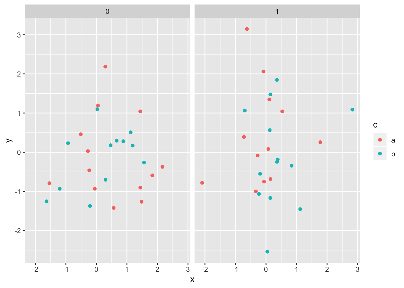
This is how the plot would look if we didn’t make any alterations to any of the labels. Using the code above as something to build upon, let’s go through some examples of how to change different types of labels on the plot to incorporate Greek symbols and math expressions.
Plot Titles, Axes and Legend Titles
One way to modify plot titles, axes and legend titles is through the labs() function in ggplot2. In order to add math notation to those labels, we can use the expression() function to specify the label text. For example, if we wanted to modify the plot above such that the title was “\(Y \sim X\)”, the x axis was labeled as “\(\beta_0\),” and the legend title read “Values of \(\mu\),” we could run the following:
ggplot(data) +
  geom_point(aes(x = x,y = y, col = c))+
  facet_grid(~ d) +
  labs(title = expression(Y %~% X),
       x = expression(beta[0]),
       col = expression(paste('Values of ', mu)))
🌟 BTW: This website will come in handy when figuring out the math expression syntax!
Legend values
Next, let’s play around with the text of the values shown in the legend. Suppose we want to show that the names of the groups used to color the points are not actually ‘a’ and ‘b,’ but ‘\(\alpha\)’ and ‘\(\beta\)’, respectively. In order to reformat the color legend values, we’ll use the parse_format() function from the scales package.
🚨 Before modifying the plot, we will first recode the variable ‘c’ such that the values are character strings containing the expressions we want to show:
data = data %>%
  mutate(c = recode_factor(c, `a` = "alpha", `b` = "beta"))
Now, let’s modify the color labels:
ggplot(data) +
  geom_point(aes(x = x,y = y, col = c))+
  facet_grid(~ d) +
  labs(title = expression(Y %~% X),
       x = expression(beta[0]),
       col = expression(paste('Values of ', mu))) +
  scale_colour_discrete(labels = parse_format())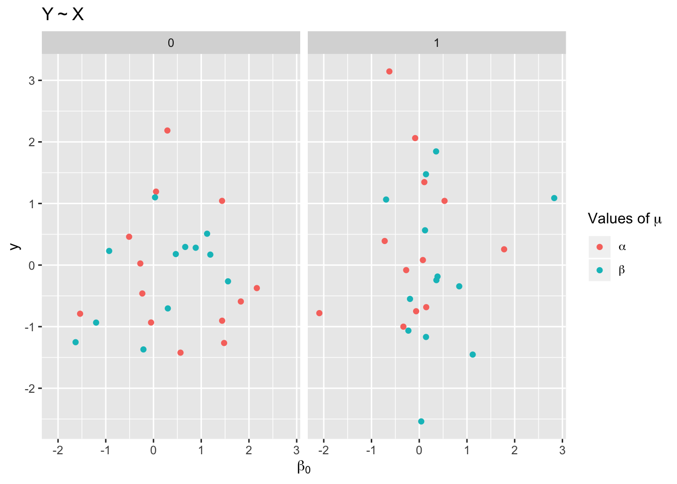
Facet Labels
Lastly, let’s change the labels of the different plot panels to read ‘\(\gamma = 1\)’ and ‘\(\gamma = 2\)’. To do so, we will specify the label parameter in the facet_grid() plotting step as label = "label_parsed".
🚨 Again, before we do this, we’ll need to recode the variable that is used to create the facet grid:
data = data %>%
  mutate(d = recode_factor(d, `0` = "gamma == 1", `1` = "gamma == 2"))
Now let’s modify the panel names!
ggplot(data) +
  geom_point(aes(x = x,y = y, col = c))+
  facet_grid(~ d, label = "label_parsed") +
  labs(title = expression(Y %~% X),
       x = expression(beta[0]),
       col = expression(paste('Values of ', mu))) +
  scale_colour_discrete(labels = parse_format())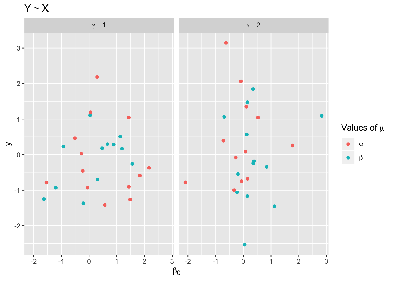
There you have it! Hopefully these examples will come in handy the next time you need to include math expressions in a plot. Thank you to Ben Williams and Jeremy Yoder for coming to my rescue on Twitter! 🙌 🎉